Showcasing your team builds trust and humanizes your brand. While many users rely on heavy plugins to create grid layouts, you can build a responsive, professional team section using only the default WordPress Gutenberg core blocks.
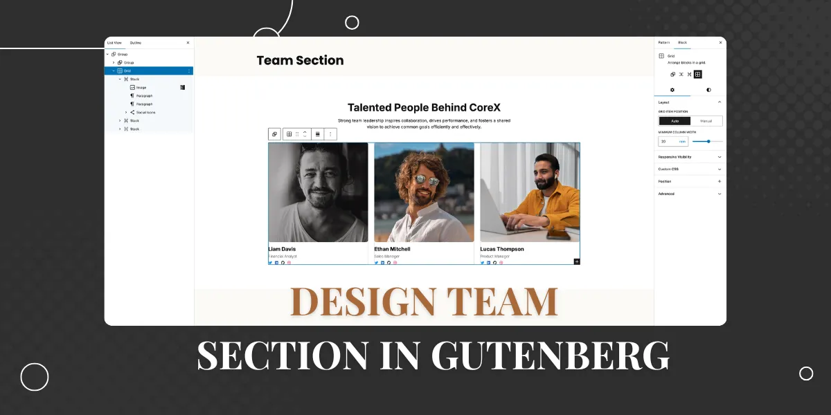
In this tutorial, we will design the following team section with Gutenberg core blocks:

Step 1: Set Up the Section Container
First, we need a main container to frame the section.
- Insert a Group Block into your page.
- Set the alignment to Full Width.
- Styles:
- Set the Background Color to White (
#ffffff). - Padding: Top:
6rem, Bottom:6rem, Left:1rem, Right:1rem.
- Set the Background Color to White (
- Layout: In the block settings, ensure the content width is constrained to
1200pxso the content doesn’t stretch too wide on large monitors.
Step 2: Add the Header
Inside the main container, we will create the title and description area.

- Add a nested Group Block. In the layout settings, set the Content Width to
700px(this keeps the text nicely centered and readable). - Heading:
- Add a Heading Block (H2).
- Text: “Talented People Behind CoreX”.
- Alignment: Center.
- Typography: Size
2.5rem, Weight700(Bold), Line Height1.2. - Spacing: Add a bottom margin of
15px.
- Description:
- Add a Paragraph Block.
- Text: “Strong team leadership inspires collaboration…”
- Alignment: Center.
- Typography: Size
16px, Weight400.
Step 3: Create the Grid Layout
Instead of using the older “Columns” block, we will use the modern Grid layout feature within the Group block for better responsiveness.
- Add a new Group Block below your header.
- Layout Type: In the block settings sidebar, change the layout from “Flow” to Grid.
- Grid Settings:
- Set Minimum Column Width to
20rem. This is the magic setting that automatically moves cards to the next line on smaller screens without needing complex media queries.
- Set Minimum Column Width to
- Spacing: Set the top margin to
3remand the Block Gap (spacing between items) to1.5rem.
Step 4: Design a Single Team Member Card
We will design one card perfectly and then duplicate it.

- Inside the Grid Group, add a new Group Block.
- Layout: Set to Stack (Vertical Flex).
- Styles: Set Background to White (
#ffffff) and Border Radius to12px.
- Profile Image:
- Add an Image Block and upload a portrait.
- Important: In the block settings, set Aspect Ratio to
Square (1)and Scale toCover. This ensures all team photos are the same size regardless of the original file dimensions. - Border Radius: Set to
8px. - Spacing: Add
15pxbottom margin.
- Name & Role:
- Add a Paragraph Block for the name (e.g., “Liam Davis”). Set size to
20pxand Color to Black. - Add a Paragraph Block for the role (e.g., “Financial Analyst”). Set size to
14px, Color to Gray (#676d77), and add8pxtop/bottom margin.
- Add a Paragraph Block for the name (e.g., “Liam Davis”). Set size to
- Social Icons:
- Add a Social Icons Block.
- Choose the “Logos Only” style and “Small” size.
- Add your networks (Twitter, LinkedIn, GitHub, Dribbble).
- Align them to the Left.
Step 5: Duplicate for the Team
Now that your first card is ready:
- Select the Group Block that contains the individual team member card.
- Click the three dots in the toolbar and select Duplicate.
- Repeat this for as many team members as you have.
- Simply click into the new duplicates to swap out the images and update the text for “Ethan Mitchell” and “Lucas Thompson.”
Conclusion
You have now built a fully responsive team grid using native WordPress blocks. By using the Group Block’s “Grid” layout, your design will automatically adapt to mobile, tablet, and desktop screens seamlessly.