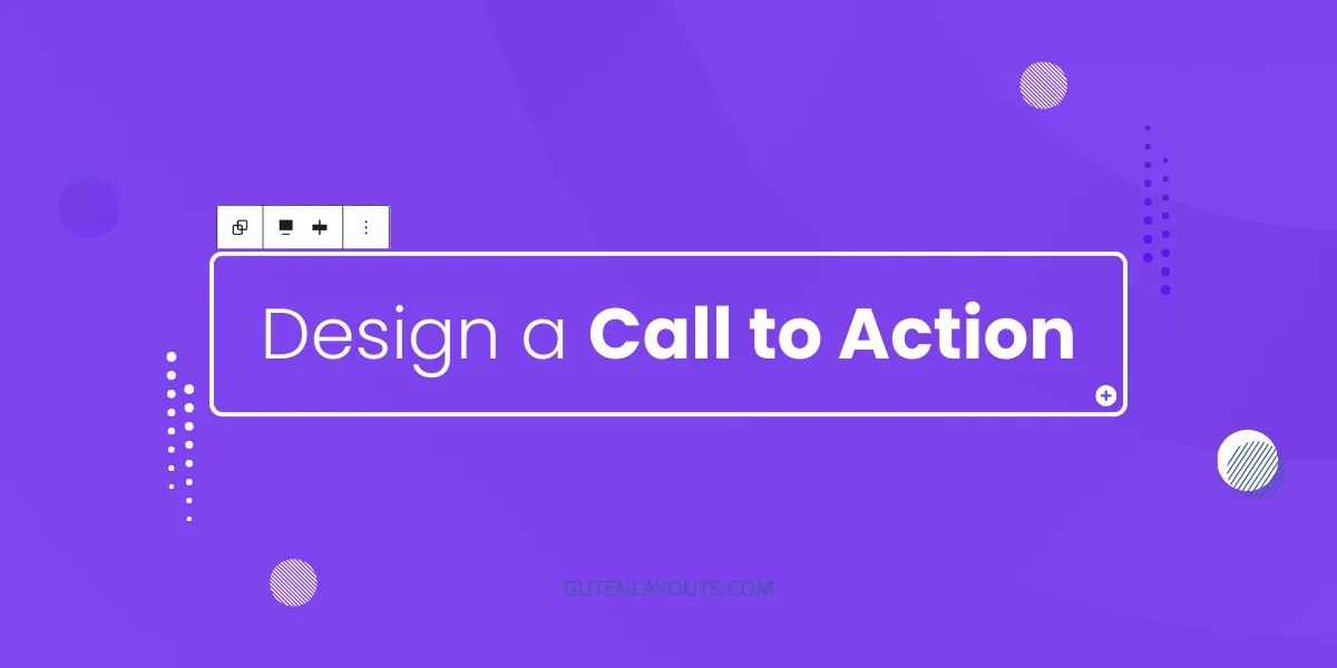
Creating a professional, high-converting Call to Action (CTA) section doesn’t require complex page builders. In this tutorial we will design the following layout using only the default WordPress Gutenberg core blocks.

01: Set Up the Main Container
The foundation of this section is a Group Block that handles the background and overall spacing.
- Insert a Group Block into your editor.
- In the block toolbar, change the alignment to Full Width.
- In the Block Settings (sidebar), under the Layout tab, ensure “Inner blocks use content width” is toggled on. Set the Content Width to
1200px. - Background:
- Go to the Styles tab.
- Upload your background image (a soft gradient or abstract shape).
- Set the Background Size to
Coverand Position to50% 50%(Center Center). - Set the background color to
#fefefeas a fallback.
- Spacing:
- Set the Padding to Top:
6rem, Bottom:6rem, Left:1rem, and Right:1rem.
- Set the Padding to Top:
02: Add the Heading
Next, we will add the main headline “Limitless Designs.”
- Inside the Group block, add a Heading Block (H2).
- Type the text: “Limitless Designs”.
- Set the Text Alignment to Center.
- Typography & Color:
- Set the Text Color to
#0a0d11(dark charcoal). - Set the Font Size to
3rem. - Set the Line Height to
1.2and Font Weight to600(Semi-Bold). - (Optional) Select the “Inter” font family if available in your theme.
- Set the Text Color to
03: Create the Description Area
To ensure the paragraph text doesn’t stretch too wide and remains readable, we will nest it inside a constrained container.
- Add a new Group Block below the heading.
- In the Layout settings for this new group, set the Content Width to
600px. This ensures the text stays compact in the center. - Inside this group, add a Paragraph Block.
- Type your description text (“Experience the freedom of unlimited designs…”).
- Set the Text Alignment to Center.
- Typography & Color:
- Set the Text Color to
#4b4757. - Set the Font Size to
1remand Line Height to1.4.
- Set the Text Color to
- Spacing:
- Set the Padding for the paragraph block to Top:
1remand Bottom:2.5rem.
- Set the Padding for the paragraph block to Top:
04: Design the Call to Action Button
Finally, we will add the gradient button.
- Below the description group, add a Buttons Block.
- Set the Justification (layout) to Center so the button sits in the middle.
- Click on the individual Button inside the container.
- Change the text to “Book A Free Call”.
- Styling the Button:
- Background: Select Gradient and set a linear gradient (180deg) using purple tones (e.g., starting at
rgb(96,48,255)and ending atrgb(114,81,223)). - Text Color: Set to White (
#ffffff). - Border Radius: Set to
5pxfor slightly rounded corners. - Shadow: Apply a “Medium” drop shadow from the styles panel.
- Background: Select Gradient and set a linear gradient (180deg) using purple tones (e.g., starting at
- Dimensions:
- Set Padding to Top/Bottom:
1remand Left/Right:2rem. - Set Font Size to
1rem.
- Set Padding to Top/Bottom:
Conclusion
You have now successfully recreated a responsive, professional Call to Action section using only Gutenberg core blocks. By utilizing nested groups and specific content widths, you maintain control over the layout on all screen sizes without needing custom CSS.
One response
helpful content with a clear explanation, thanks